BP
Research & design of a wells documentation tool
Role
User Research / UX Design / UI Design
Platform
Desktop Web App
Intro
BP is one of the world's largest multinational oil and gas companies and they have been in the process of digitising their processes. Falcon is a documentation app for internal use. It is predominantly used by reservoir engineers and geologists.
The problem
Users were working on Word and Excel documents for wells and sharing them via e-mail. They were starting to lose track of what the most up to date documents were and which ones needed to be reviewed and approved. Therefore they needed a web app designed where they could work on well documentation collaboratively and tracked.
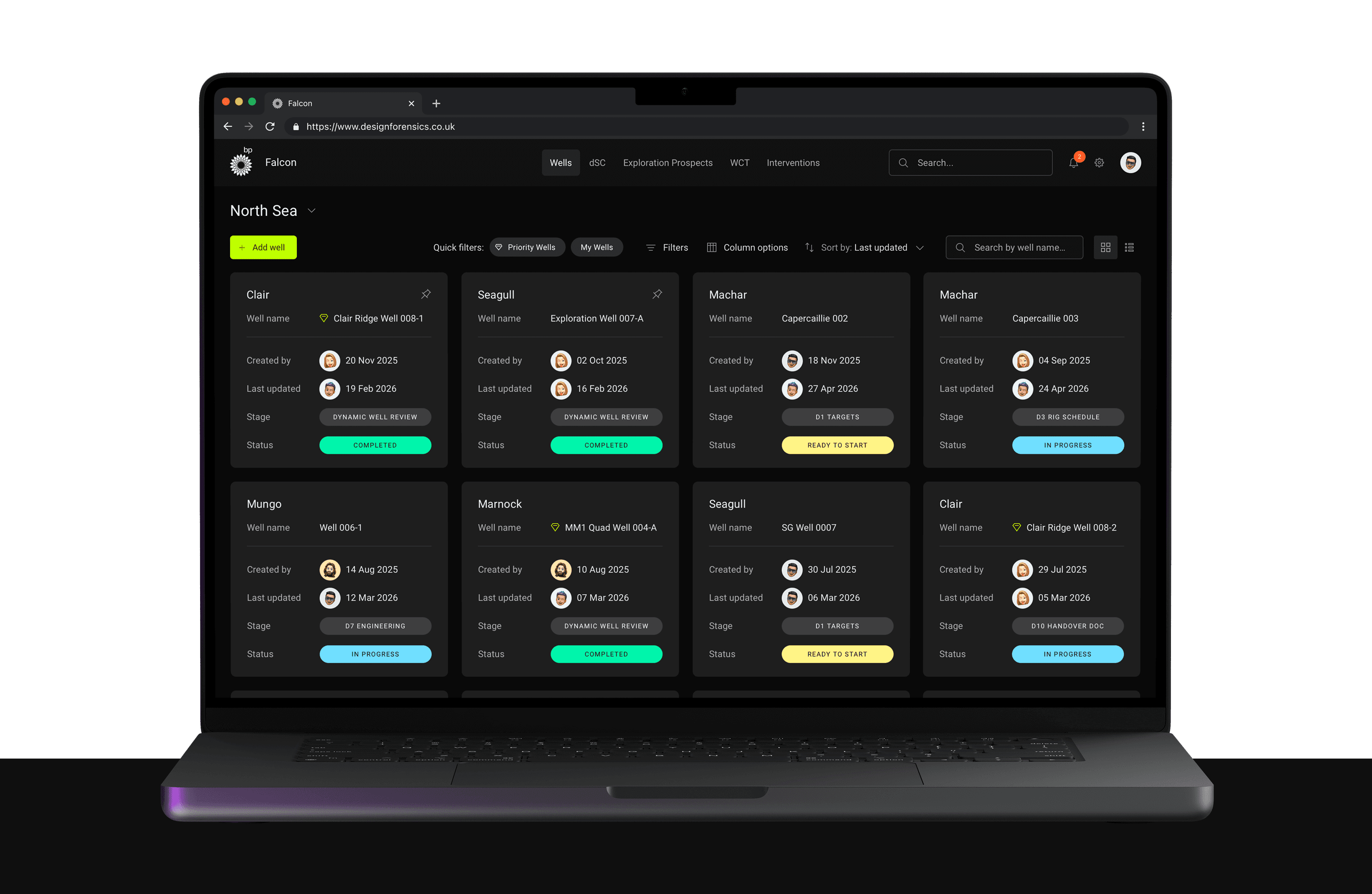
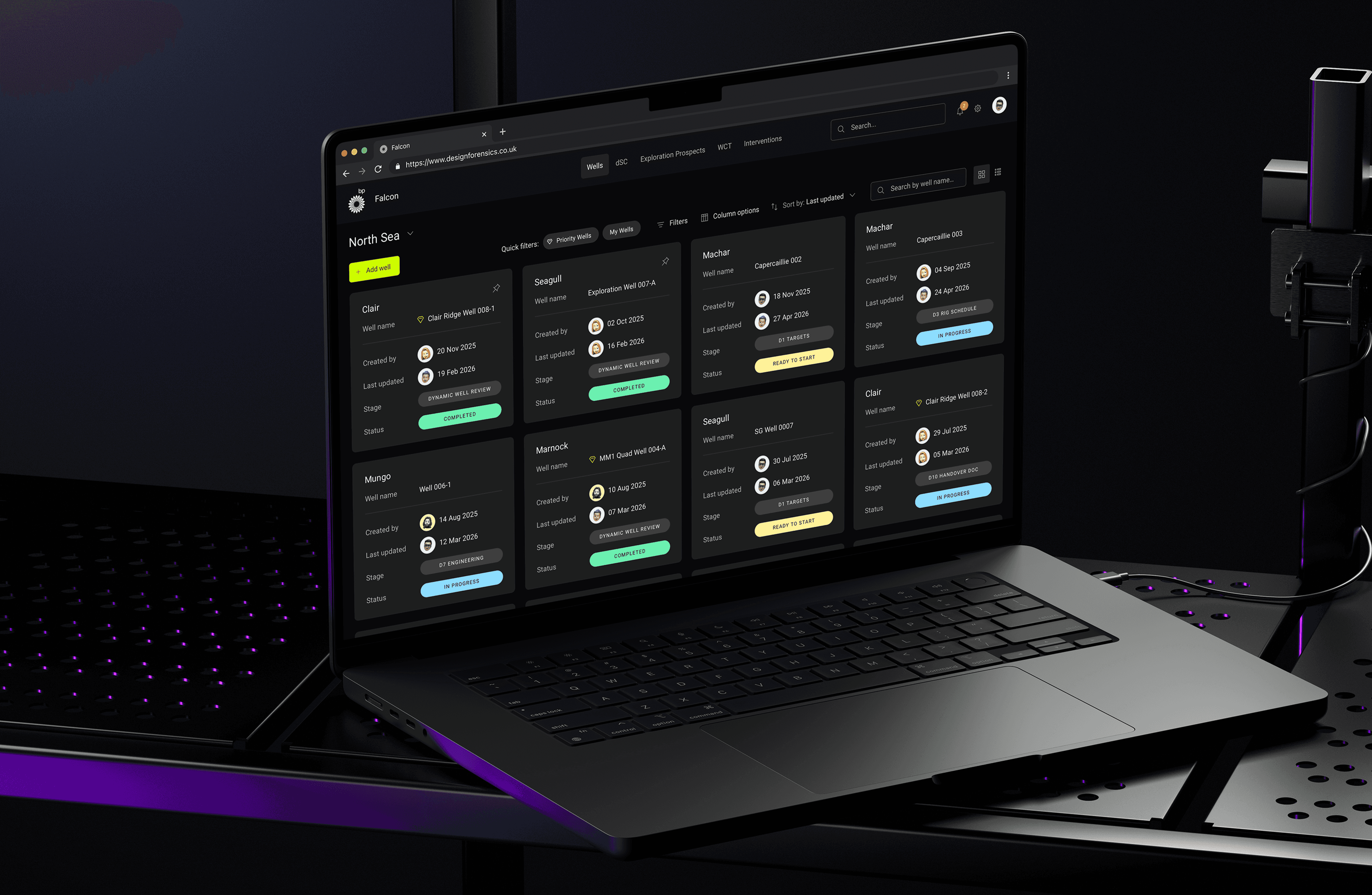
Dashboard for wells documents
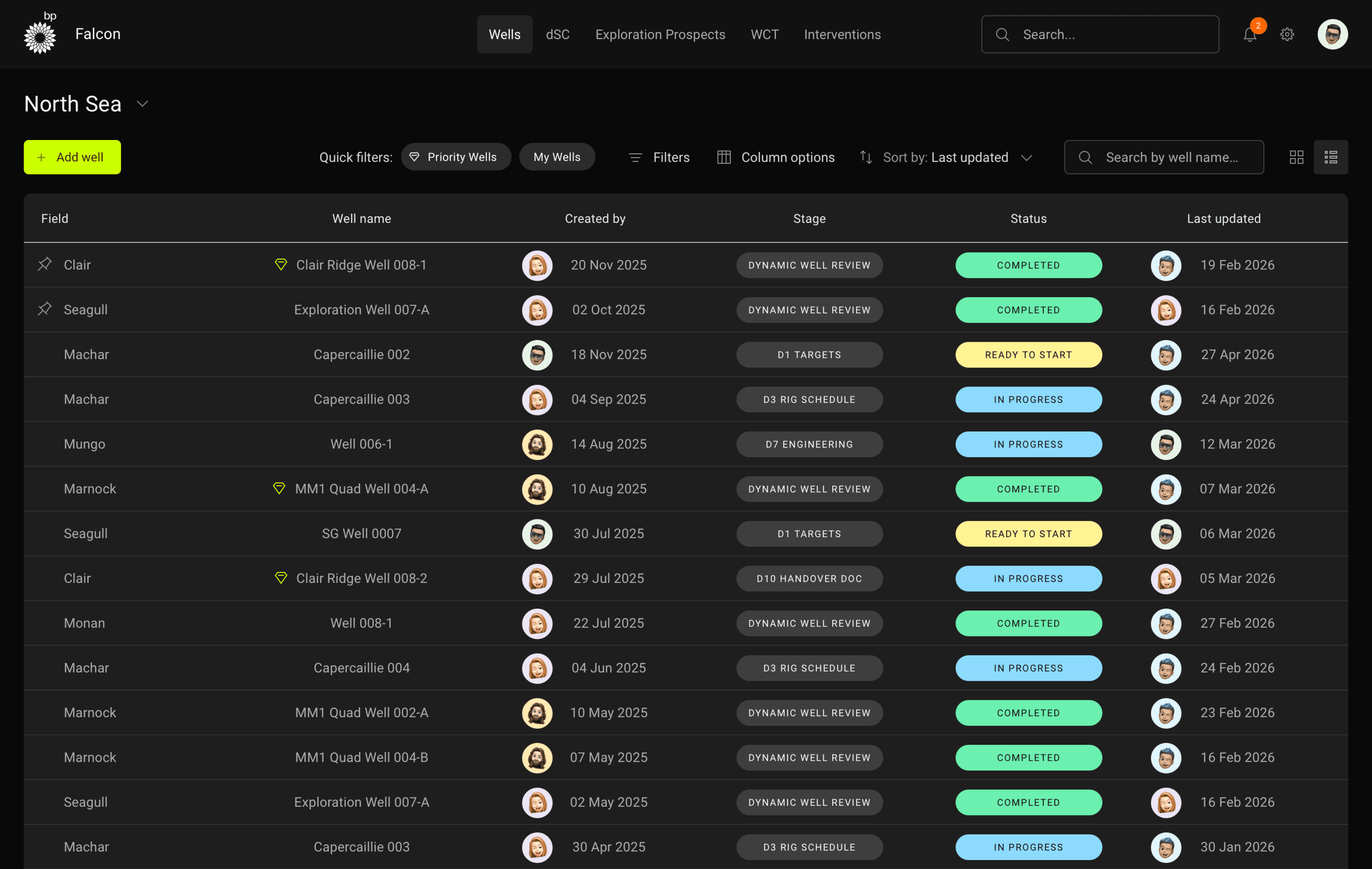
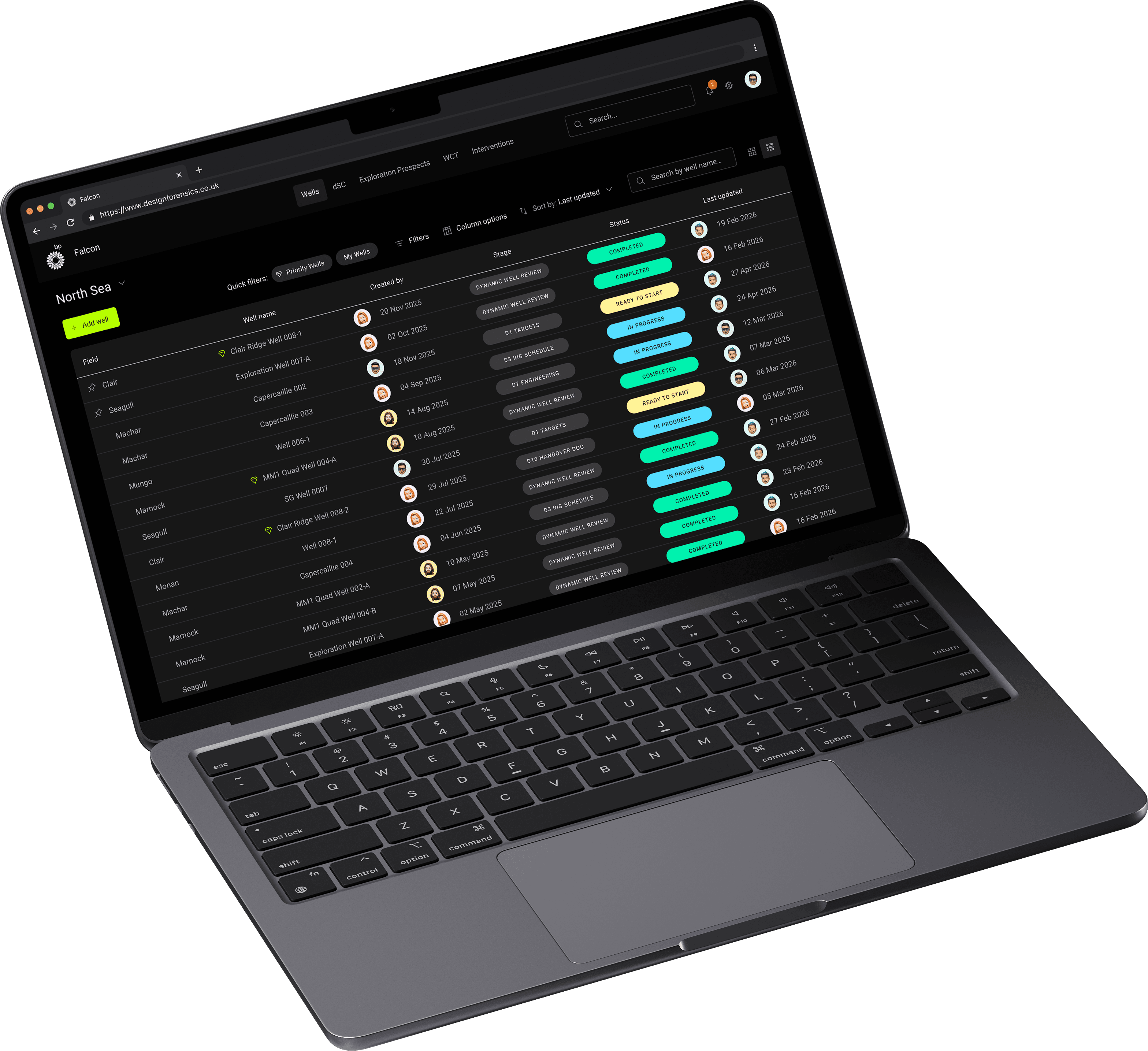
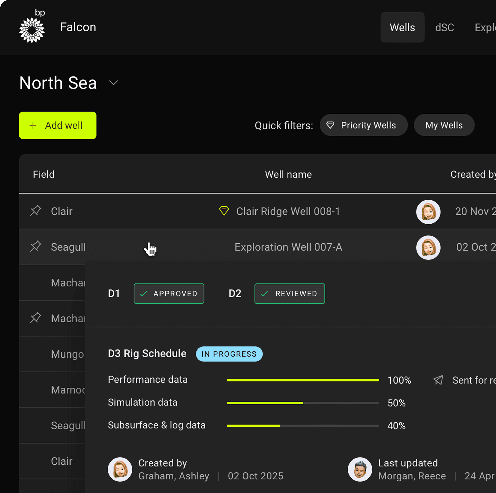
Card view to easily scan data for your wells
Users want to see what stage a document is in and the status of the documents for that well. This enables the design to show who created the well and updated it last. The dashboard design incorporates a search for the whole product and also to refine the wells area.
Stakeholder requirements gathering
I spoke with the stakeholders to find out what they require from the product in terms of viewing and editing documents. They’re the ones who requested this product to be built because of the issues they faced. So it was ideal to find out what they wanted in terms of features, for me to validate with other users.

User interviews
Participants
Senior Wells Engineer
Advisor for Subsurface Well Delivery
Senior Drilling Engineers
Senior Completions Engineers
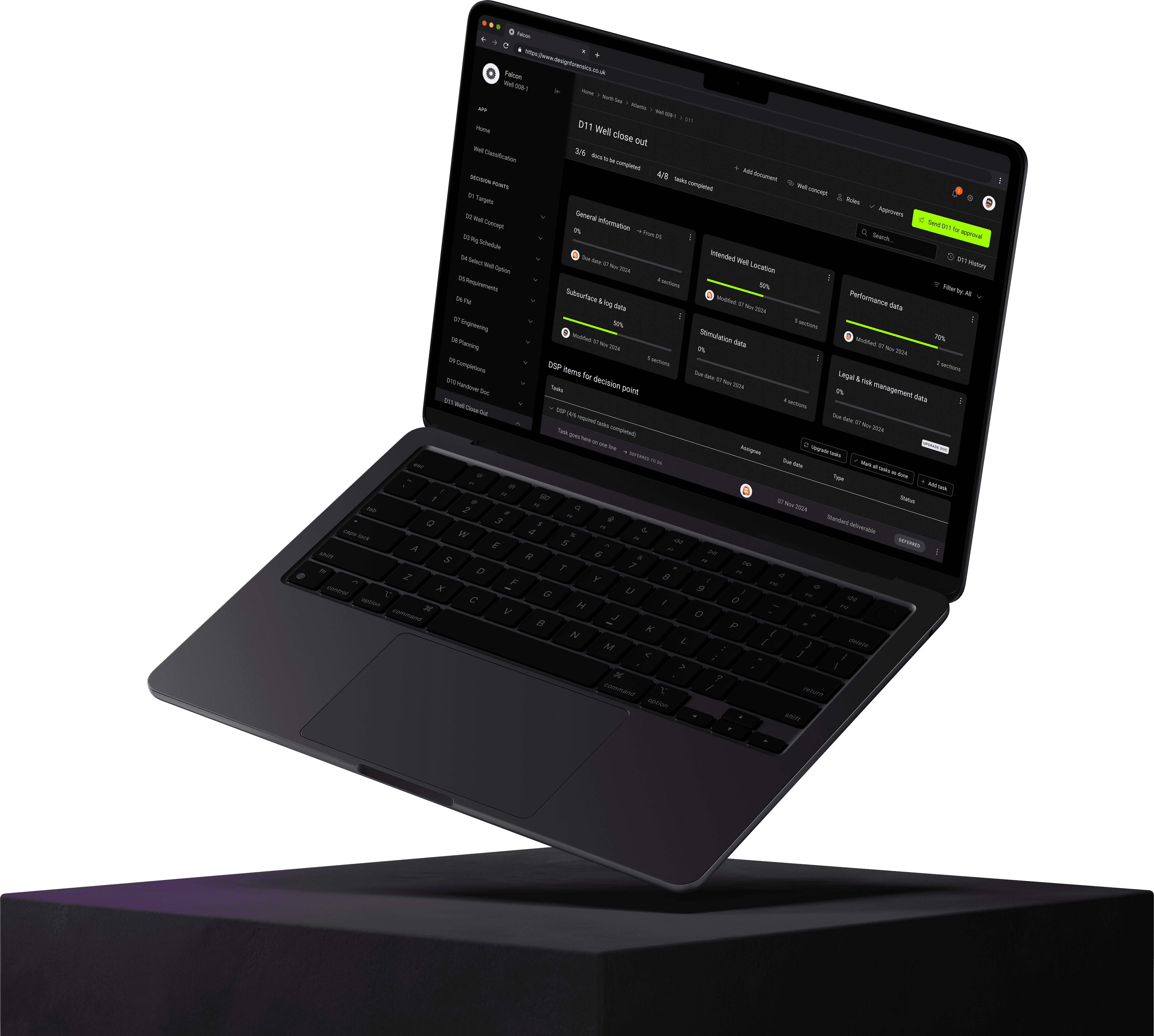
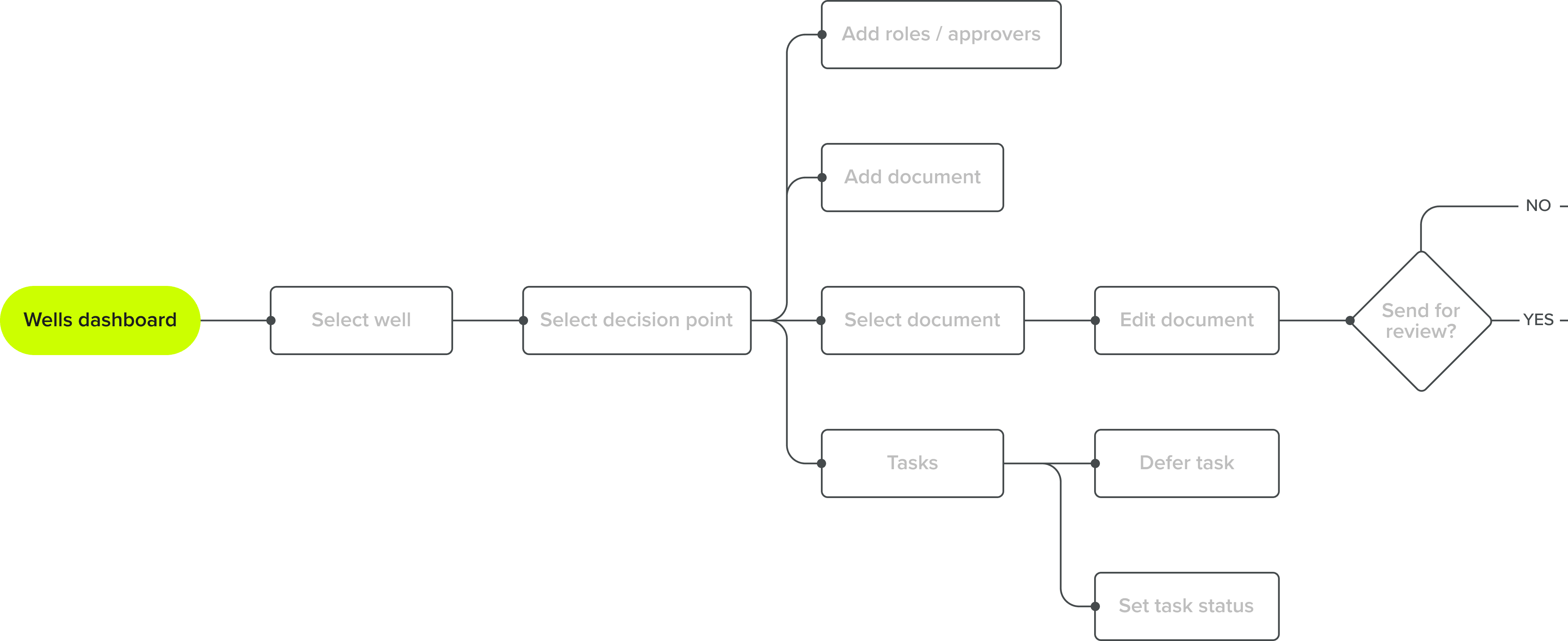
Decision points
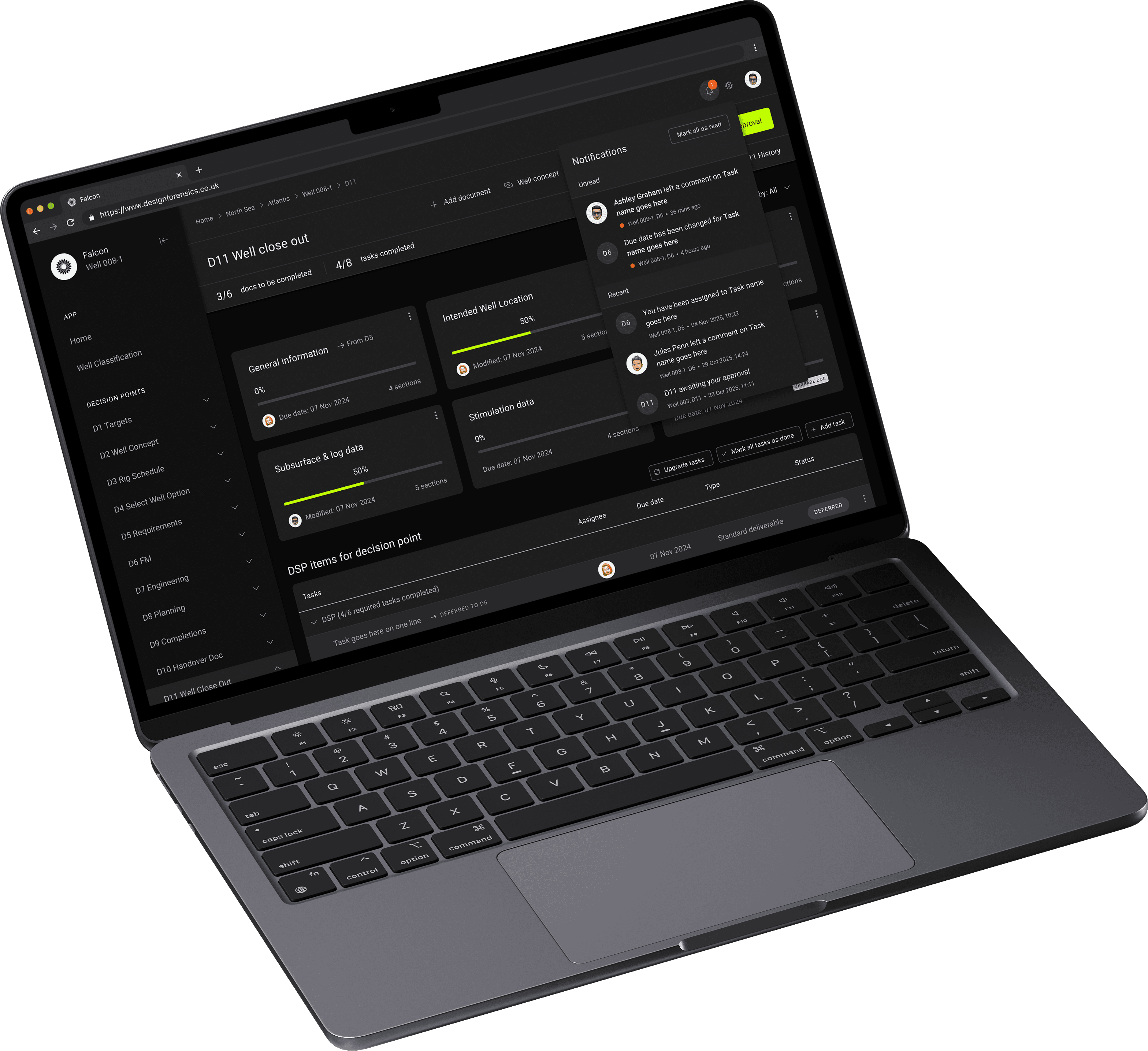
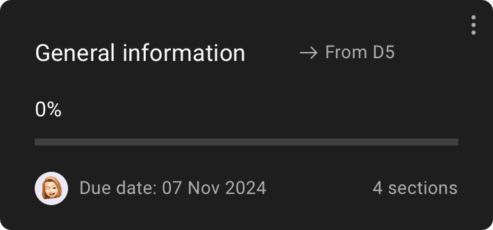
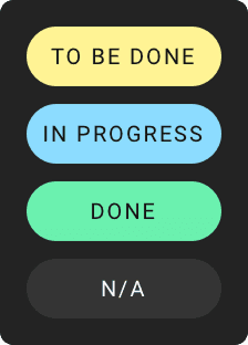
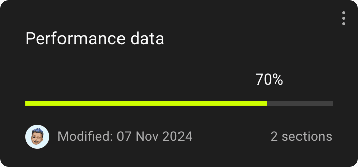
The decision point screen tested well, and I refined it based on stakeholder feedback and user interviews. Documents are now displayed as cards with progress indicators, showing the last modifier and allowing users to defer them.
A sticky header tracks completed documents and tasks, while users can assign reviewer and approver roles and submit the decision point for approval. A history log records modifications for transparency, and search auto-refines document and task lists for efficiency.
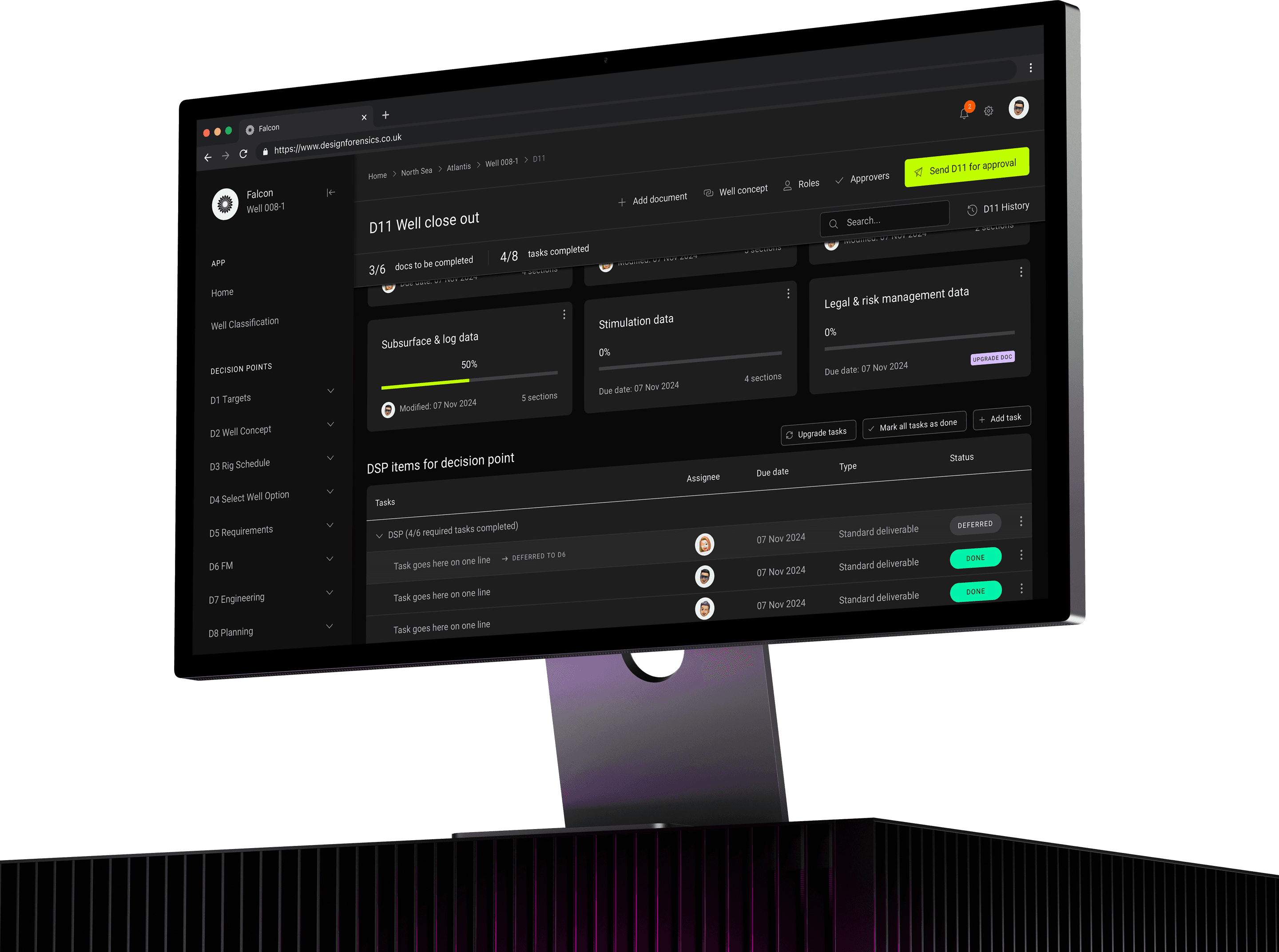
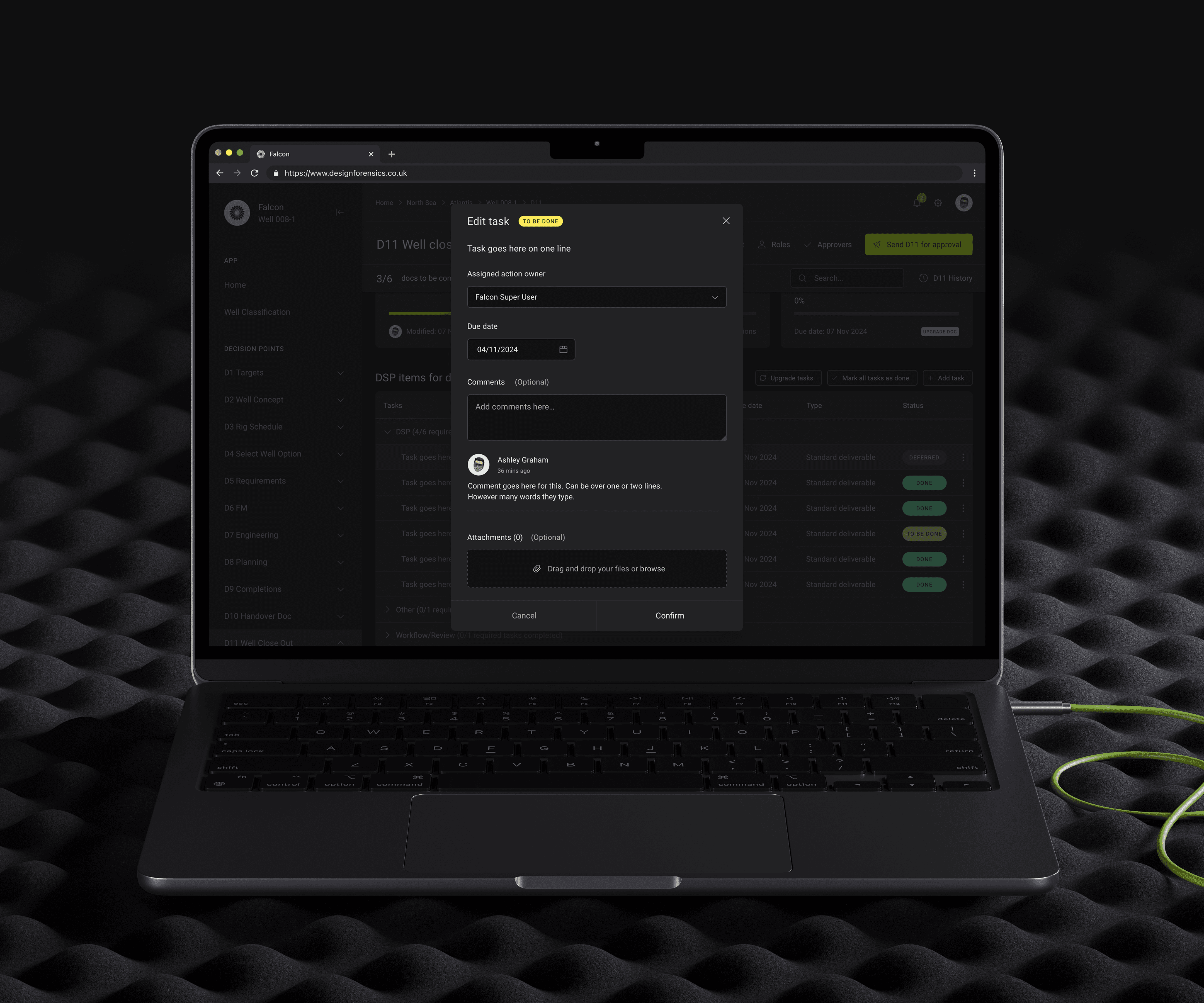
Tasks
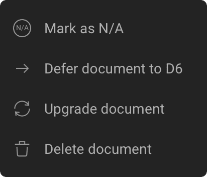
User interviews revealed that users wanted the ability to comment on tasks, add an assignee so that they get notified of a task they need to work on and defer or mark tasks as N/A. These features look to improve workflow efficiency, accountability and collaboration.
User flow
This is an example of one of the wells user flows for a logged in user, who already has their default region selected. I worked on the user flows to work out the most intuitive and easiest route for a user to complete documents, work collaboratively and send for reviews/approvals.
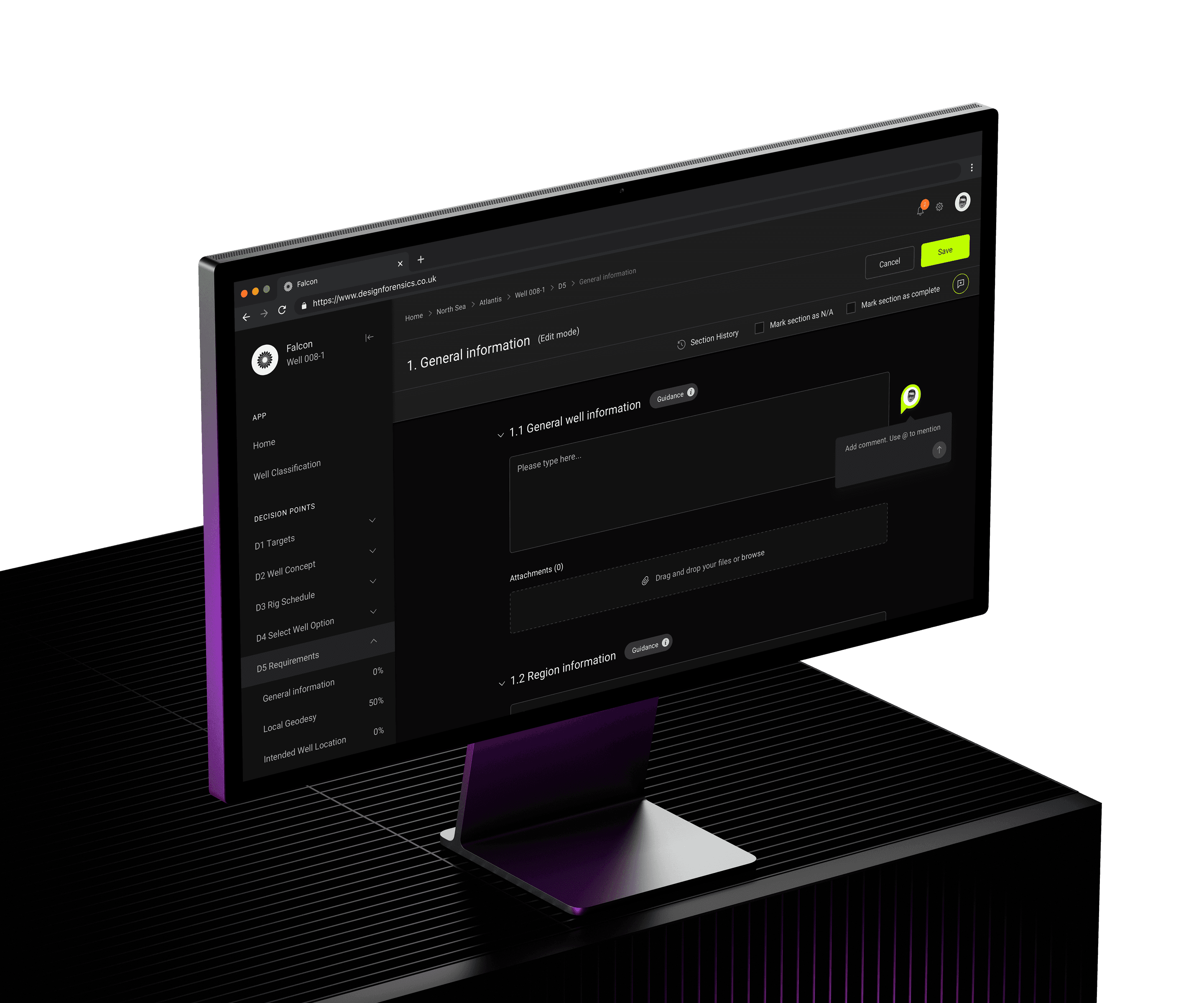
Document edit mode
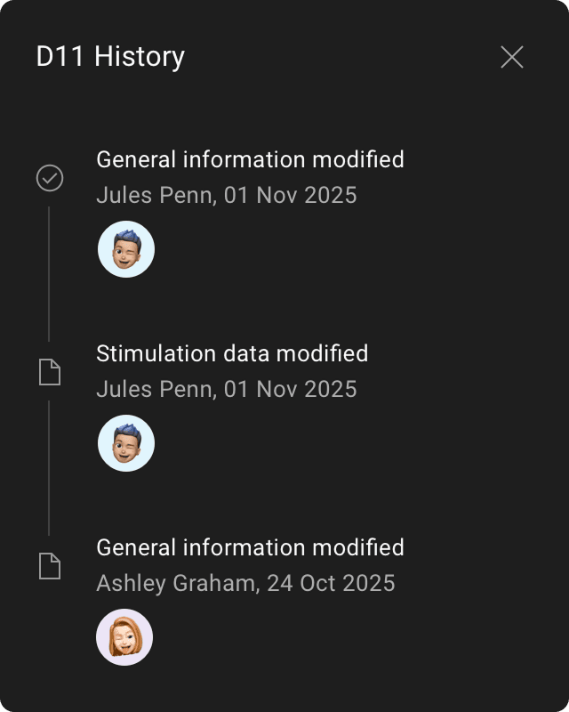
The design tested well for easy text input. Based on user feedback, I added drag-and-drop attachments, a guidance button for complex sections, checkboxes to mark as N/A or complete, and a history view for tracking changes from themselves or other users.
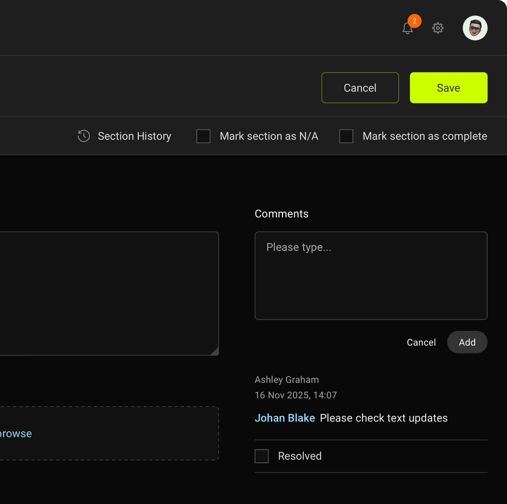
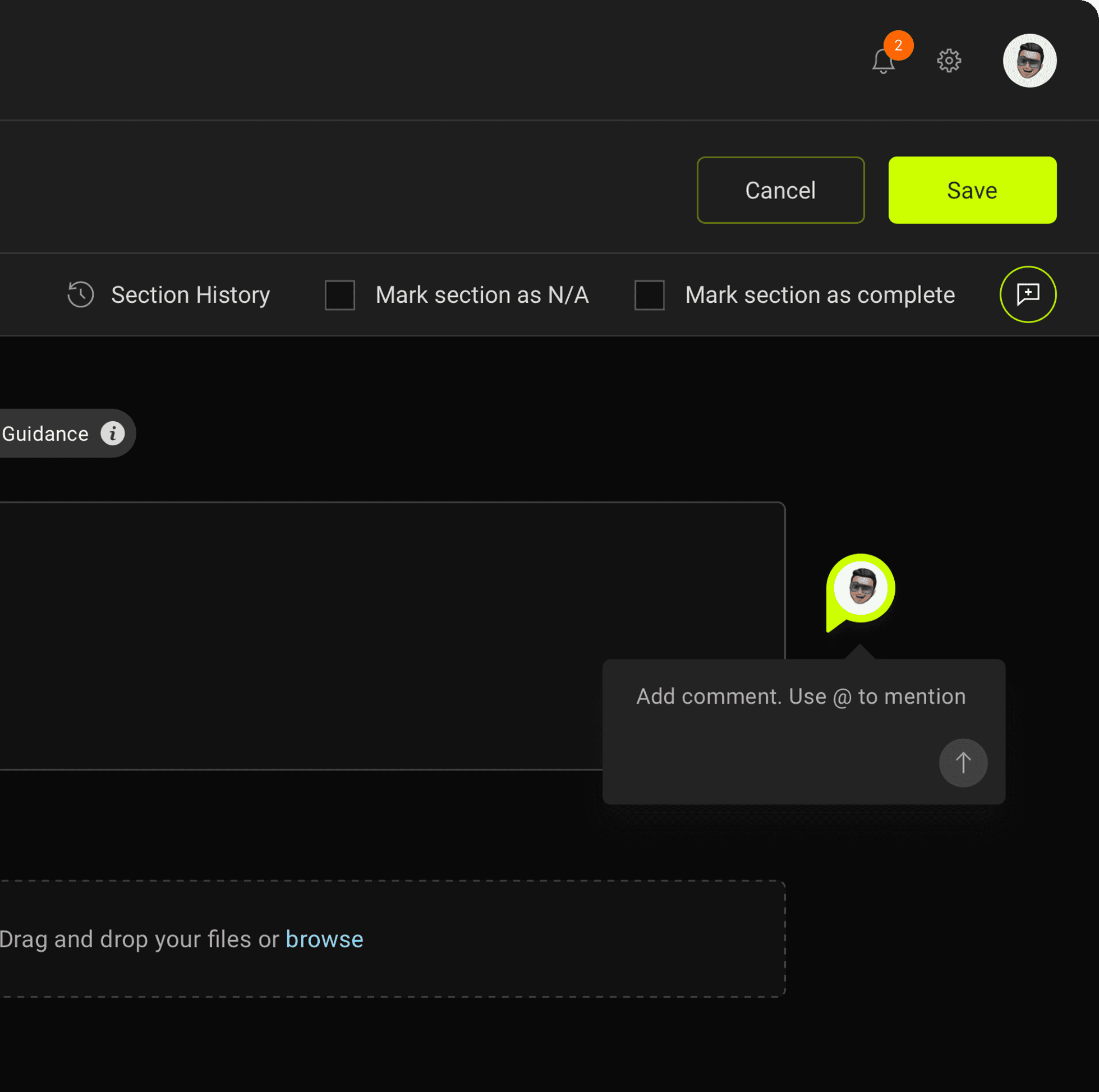
Commenting
Initially, I placed the comments feature next to input fields in edit mode, but user tests revealed a need for commenting on specific areas. As the users are used to using Mural, I redesigned it to allow free comments anywhere on the screen with easy tagging.
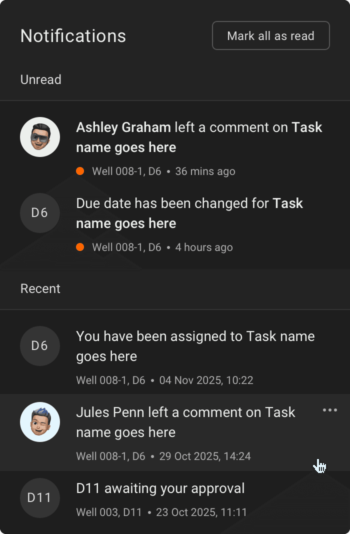
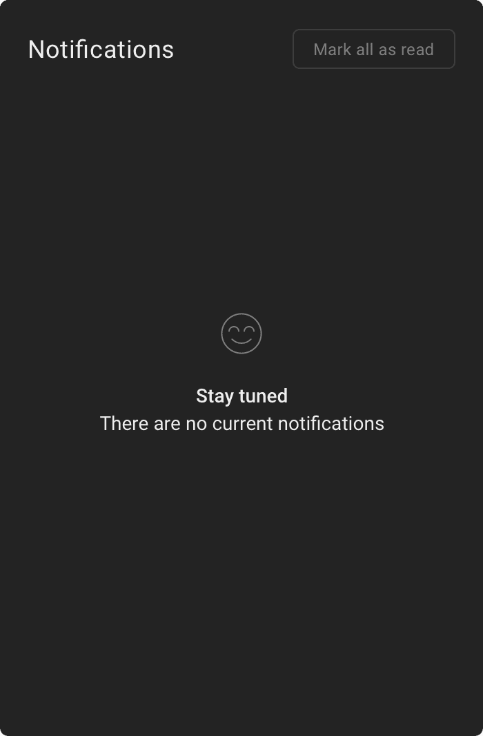
Notifications
Initially I had designed an actions panel for the dashboard. However it was becoming confusing what the difference between actions and tasks were, so the best way to inform a user was to introduce notifications.
Because we are sending documents for review, approvals and also by adding the commenting function, the notifications needed to be designed to show the users what they may have been tagged in or requested to do.